

Problem
What distinctive features can we incorporate into an online jewelry website to set it apart from other established stores?
OVERVIEW
Outcome
We created an easy to navigate website with features that make customers confident in their purchase. After a usability test, the project achieved a remarkable 92% task completion rate, with receiving positive feedback from users.
CLIENT
INFO
Role
UX Researcher and UX/UI Designer
Team
3 UX Researchers and UX/UI Designers, 1 Developer & Me
Timeline
12 weeks
Tools
Figma, Optimal workshop, Zoom, and Photoshop
Mount Antero Gallery
Mount Antero Gallery is a newly established jewelry business in Canada that creates products with valuable gems and diamonds.
Understanding users' needs- Interview
We conducted interviews with 12 experienced online jewelry shoppers to explore the factors influencing their trust in new jewelry websites. Our study also delved into the motivations and barriers affecting their decision to purchase from online jewelry stores
USER RESEARCH
Buyers ideally prefer physical stores, where they can personally try items before making a purchase. Therefore, incorporating a virtual try-on feature would address this need.
Users appreciate platforms that offer a diverse range of items to cater to various preferences. Providing customization options allows them to tailor their choices to their taste.
To build trust with users, the website can showcase high-quality images of products and provide information about the origin of gems and diamonds. This approach aligns with users’ preference for assessing product quality.


Key Insights
Understanding users' needs- Survey
After identifying the possible users' expectations and pain points, we felt the need to get more information about users' expectations from more number of participants, as well as understanding the demographics. So, we conducted a comprehensive survey with 37 participants to comprehend their perspectives.
User Research
Key insights
The participants expressed their need for a:
Transparent size information
Information about return policy
Detailed product descriptions
Diverse product images
Easy navigation
Design variety


Understanding the opportunities
After pinpointing the business needs, we analyzed prominent jewelry stores to understand their current features and identify any gaps.
ANALYZING MARKET


Key insights
Features like customization and virtual try-on can differentiate our website from other competitors.
Ensuring high-quality images and providing comprehensive product information is essential for meeting user expectations.
Adding the ability to style products with other jewelry can fill a gap and enhance our website’s offerings.
Including clear details about jewelry care and accurate product sizing aligns with industry standards and is expected by users.
Understanding the User
Now it was time to draw from the data to think about who we were designing for.
PERSONA


Our user was likely a woman living in Vancouver. She needed an easy way to purchase jewelry online, with options for customization and virtual try-on, to see what she could buy as a wedding gift.
Creating the persona guided our design decisions when we faced with choices. This ensured consistency of our design and its alignment with user expectations.
How do users think the website should be organized?
To understand the optimal placement for concepts, features, and pieces of information, we used Optimal Workshop platform to conduct a closed card sorting with 10 potential users. The following is the analysis of the data.
CARD SORTING


Home Page
1) During the card sorting exercise, 50 percent of participants placed the virtual try-on option on the home page. However, in the usability test, all participants expected to find this feature on the product page.
2) We removed the "Shop by Category" section after discovering that most users relied on the navigation menu to search for categories.
3) Based on the users' suggestions, we moved the information about the origin of diamonds and the hypoallergenic collection from the footer to the main body of the homepage.


Product Page
1) Based on the users' emphasis on product information, we initially presented this information in a table to make it easily visible. However, we discovered that most users looked for this information under the "Add to Bag" button.
A/B testing also revealed that the product information should be in a closed tab.
USABILITY AND ITERATION (PHASE 1)
What did our users think?
Based on the insights gathered from user research, each team member sketched initial ideas and concepts on paper and shared them to receive feedback. We then created low-fidelity wireframes to outline the basic structure and facilitate user testing.
1
2
3
3
1
MOOD BOARD AND UI KIT


What did we do for visual direction and consistency of our design?
We developed a color palette and UI kit to ensure a cohesive and appealing design aesthetic. Drawing inspiration from the platform's name, Mount Antero—a renowned mountain known for its aquamarine mines—we crafted a mood board to guide our color choices.
DESIGN IDEATIONS (EXAMPLES)
How did we address the problems identified during the research phase?
A: Size Guide
Finding: During our interview, we found that many users struggled with visualizing the actual size of the products.


Solution 2: To help users better understand the products' sizes, we not only provided detailed size information on the product page, but also designed visual representations by comparing the products with accessories
Solution 1: We included a picture of a model wearing each product to help users quickly grasp the size without reading detailed descriptions.
Solution 3: We provided detailed size information on the product page.
B: Product Coordination
Finding: Several interviewees expressed a general interest in understanding how products can be paired with others. Additionally, this option was not found on competitor websites. Incorporating such a feature could differentiate our brand and give us a competitive advantage.
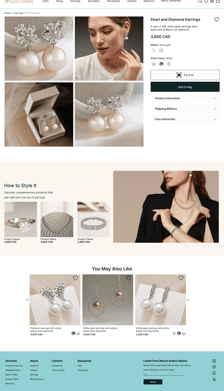
Solution: We incorporated the "How to Style It" section into the product page to help users to coordinate their selection with other products.


C: Visual Clarity
Finding: Users expressed the need to see multiple images of the products to understand their appeal and details.
Visual Clarity
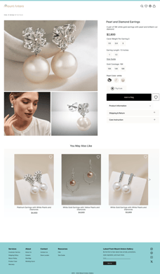
Solution: We included a video displaying the products from various angles and added a zoom feature for each image to highlight the details.


Before phase 2 usability test
After phase 2 usability test
Product page
At the first glance, users couldn't find the "try on" button or understand its icon. To improve visibility and clarity, we enlarged the button and replaced the icon with a more relevant one
USABILITY AND ITERATION (PHASE 2)
What did our users think?
After creating a high-fidelity prototype, it was time to conduct another usability test to understand how users interact with the design and identify any remaining issues that need to be addressed for a seamless user experience.


Virtual Try-On
In the first version of the virtual try-on experience, users were able to upload a photo to see how jewelry would appear on their faces. However, the feature allowing them to view jewelry in real-time on their faces is still unavailable.
In the final version, users could scan a barcode shown on the screen to instantly access their own image. This enabled them to seamlessly preview the desired jewelry on their face next to the model image on the website.
When we tasked users with purchasing a pair of earrings as a gift, we noticed they sought information about the gift, including the wrapping. In response, we added a picture of the gift box to the product page and included an option to add a note on the payment page.
Before phase 2 usability test
After phase 2 usability test
What challenges did we face while designing this platform?
Marketing
Challenge: As a newly established business, our client's unclear marketing plans presented challenges.
Solution: We set up more meetings with the stakeholder to clarify the business plan.
Design
Challenge: Due to the incomplete finalization of jewelry picture photography and editing, we had to use freely available images. However, some free images lacked the necessary level of detail.
Solution: In Figma, we've included detailed notes for both developers and stakeholders, outlining the specific information each picture should convey.
KEY CHALLENGES
RETROSPECTIVE
Final thoughts & takeaways
Effective communication with team members and stakeholders is the key factor in addressing challenges.
Integrating AI into the virtual try-on feature significantly enhanced user satisfaction. I plan to incorporate AI into my future projects to offer more user-friendly features.
Making a balance between users’ needs and the stakeholder’s marketing strategy is crucial for the success of any product.
