About the Project
Jooay is driven by the goal of connecting individuals with disabilities to leisure activities through its platform.
Business Objectives
Developing new features to increase user engagement and retention.
Info
My Role: UX Designer
Team: 3 UX Designers & researchers, 1 Product Manager, 2 Developers
Tools: Figma, FigJam, Optimal Workshop, ChatGPT, Color blind, Contrast Checker
Client
McGill University School of Physical & Occupational Therapy
Problem
Despite a strong rate of user acquisition, Jooay struggles with a low retention rate, indicating that users are not staying engaged with the app over time.
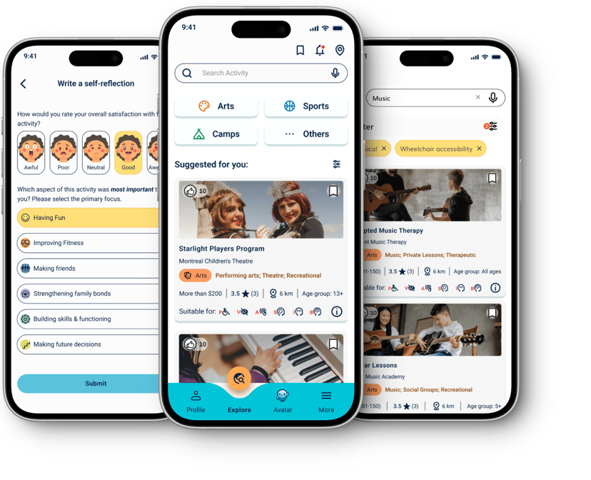
Overview
Outcome
I redesigned the entire application to enhance usability and ensure compliance with WCAG guidelines, which received positive feedback and high satisfaction during usability testing
.
Design Process
Identified design issues through heuristic evaluation.
Created sketches for low- and mid-fidelity wireframes to visualize initial ideas and concepts.
Conducted multiple iterations on low- and mid-fidelity wireframes based on usability testing outcomes and stakeholder feedback, ensuring continuous improvement of the design.
Refined and enhanced the design system to align with accessibility guidelines.
Developed high-fidelity mockups to validate and communicate the final design versions, incorporating insights from the iteration process.
Heuristic Evaluation
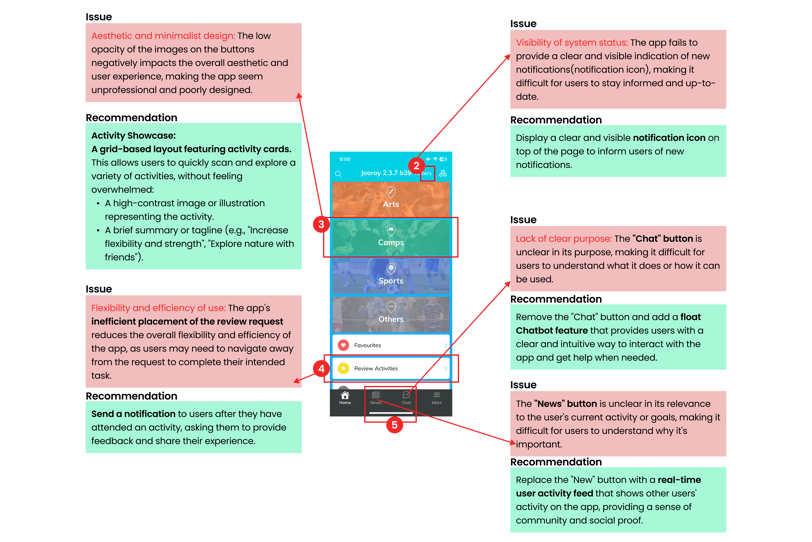
We started the work by evaluating the existing App to find out the design issues.
Key Takeaways
Our evaluation revealed significant usability and accessibility issues within the application, including:
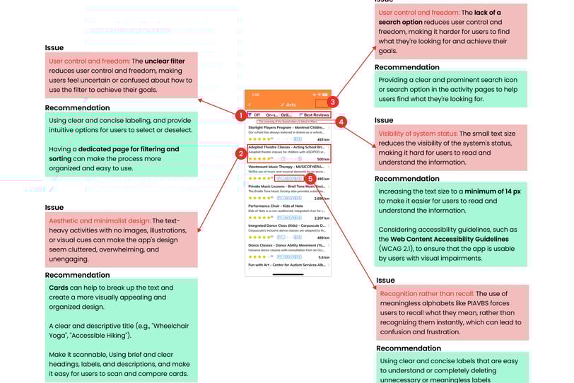
Poor visibility of system status
Inconsistent design standards
Lack of flexibility for diverse users
Cluttered interface
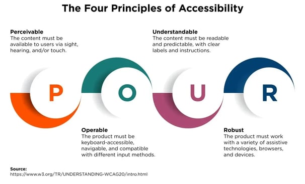
Misalignment with WCAG standards
Identifying Areas for Maximum Impact
Accessible Design
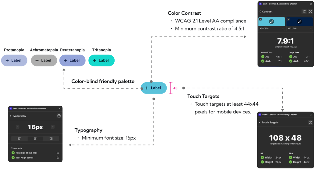
With youth with disabilities as our primary users, accessible design became our top priority
✅ Colorblind Friendly Design
✅ Plain Language Usage
✅ Optimized Tappable Areas
✅ Readable Typography
✅ Intuitive Navigation
✅ Screen Reader Compatibility
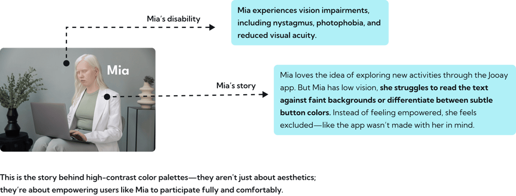
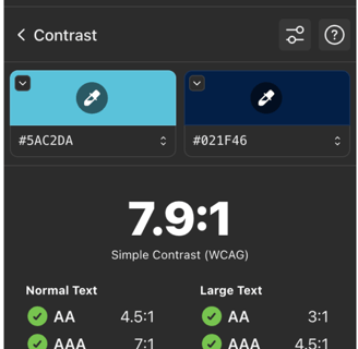
Our user research revealed that one of the biggest challenges youth with disabilities faced in existing and similar apps was the difficulty distinguishing between text, buttons, and background elements due to the use of low-contrast colors.
Choosing a Color-Blind-Friendly Palette
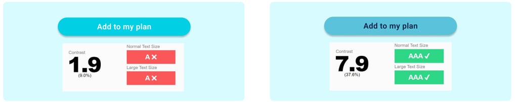

The high-contrast color palette used in Jooay's design, specifically the vibrant blue color (#01CFE4), poses a few issues:
Insufficient contrast with white text
Inadequate contrast with dark text
Challenging for users with visual impairments
Problem
The current blue color is too vibrant and doesn’t provide enough contrast with the white text on the buttons, impacting readability. It makes it harder for users with visual impairments.
Solution
Maintaining the brand's visual identity was essential, so we adjusted the blue tint to soften its vibrancy while enhancing readability by using a darker text color.
Challenges with Jooay's High-Contrast Color Palette
Implementing a High-Contrast Color Pattern
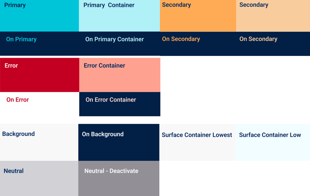
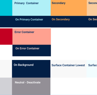
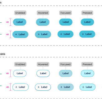
Accessible Color Pairings:
We paired dark text with light backgrounds and vice versa to ensure readability across all elements, meeting WCAG (Web Content Accessibility Guidelines) standards for contrast ratios.
Distinct Visual Hierarchy:
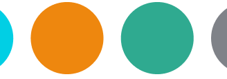
Buttons and interactive elements used bold, saturated colors like deep blues or vibrant oranges to stand out clearly.
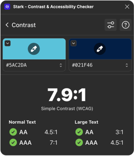
Test-Driven Design:
Every color palette was tested using tools like Stark-Contrast &accessibility checker and with real users who had varying levels of vision impairment to ensure functionality and comfort.
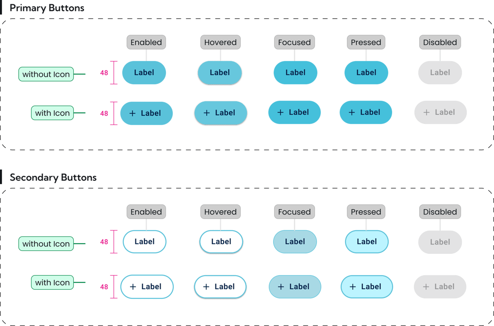
Button Hierarchy and Accessibility
Imagine Mia with low vision trying to plan an activity. A well-designed button—vivid, well-placed, and clearly labeled—gives her confidence that her action has been successful.
Accessibility Considerations
How did I create a clear and simple iconography
I created an inclusive design that supports users with various cognitive abilities, visual processing capabilities, and assistive technology needs. This is an example of icon design principles for Jooay:
Visual Simplicity: Icons should be minimalistic and easily recognizable
Semantic Clarity: Each icon must have an unmistakable, intuitive meaning
Accessibility Considerations: Providing high color contrast and scalable without losing detail
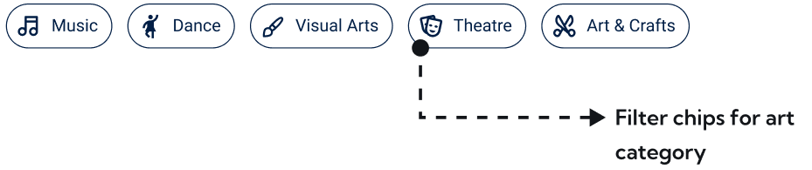
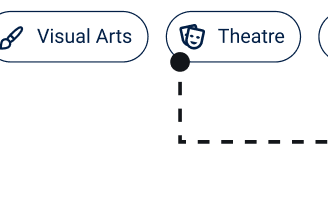
The Importance of Accessible Input Chips
I created an accessible input chip component designed with Alex in mind. Featuring large touch targets, clear labels, Alex can quickly and effortlessly select, edit, or remove tags.
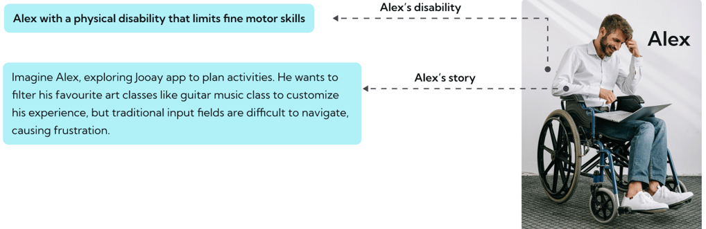
Adding icons to each chip enhances visual recognition and differentiation. Users can quickly identify tags based on the icons
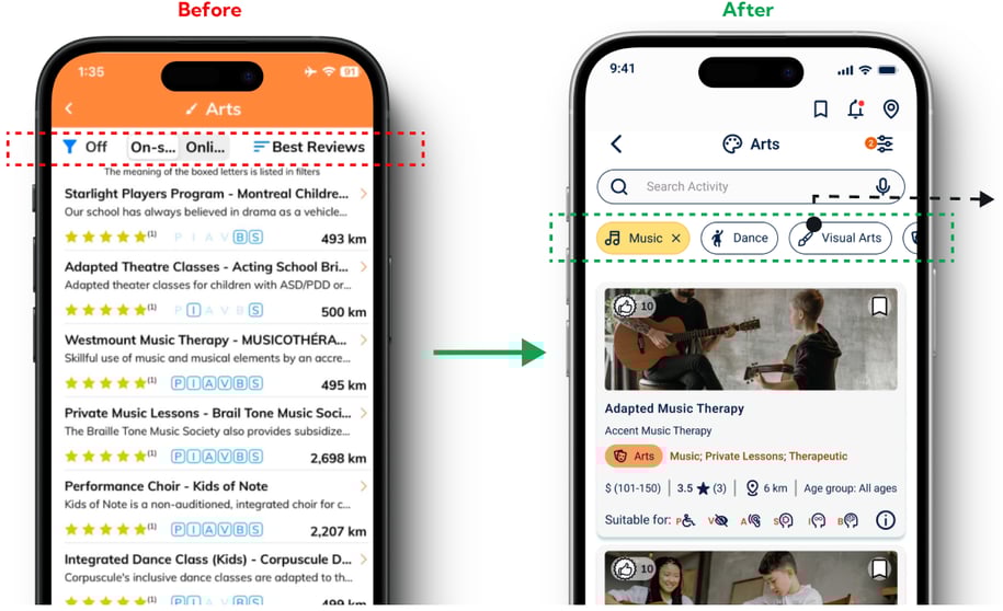
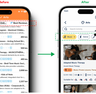
Problem: Unclear Filter Options
Users were often frustrated with unclear filter options that reduce their control and freedom. How can users use the filter feature to reach their goals?
Solution: Clear Input Chip Filter
Our input chip filter provides a clear and concise way for users to filter content. I used simple and descriptive labels, empowered users to make informed decisions about their filter options.
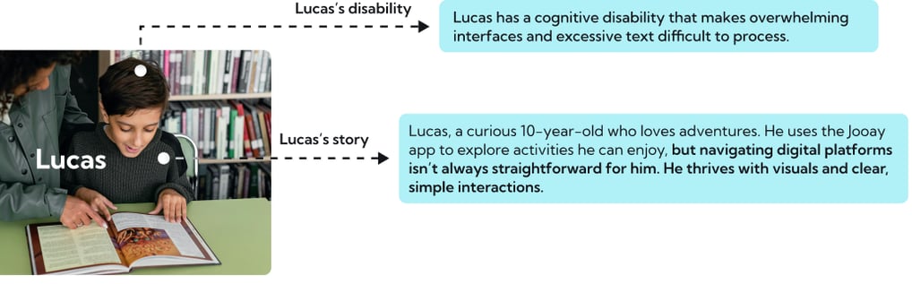
Creating Accessible Cards
When I designed the activity cards for the Jooay app, I thought about Lucas and children like him. Each card needed to be visually engaging, easy to scan, and universally understandable.
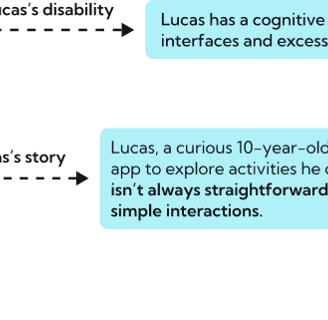
Activity name Organization name Program category Description Accessibility features
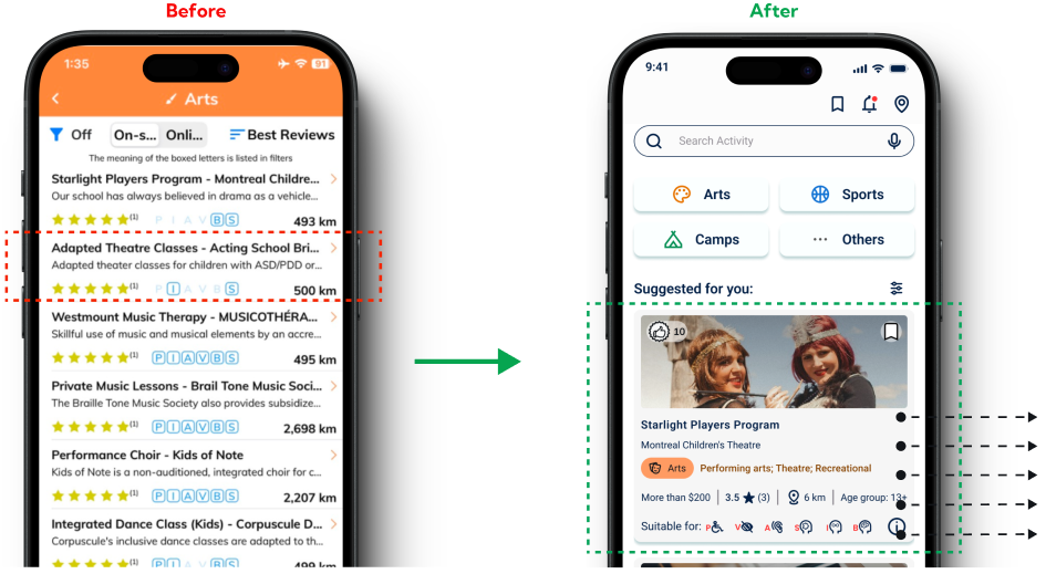
Problem:
Users with cognitive or learning disabilities might have difficulty remembering the meaning of each alphabet (P, I, A, V, B, S), which can cause increased cognitive load and frustration.
The cards were text-heavy, which made them hard to read.
Solution:
Using universally recognized icons
explanatory tooltips enhance intuitiveness for users with cognitive or learning disabilities, reducing confusion and errors.
Using color-coded tags to indicate accessibility features.
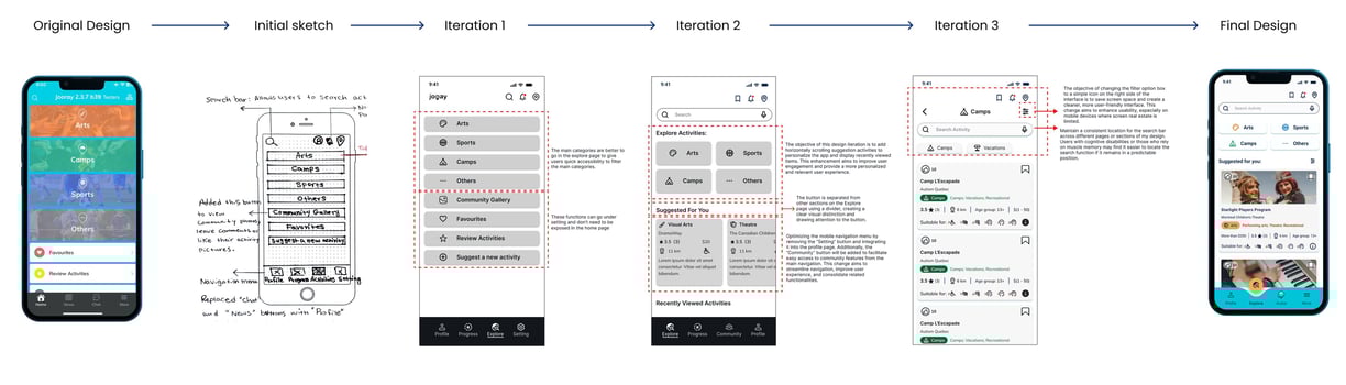
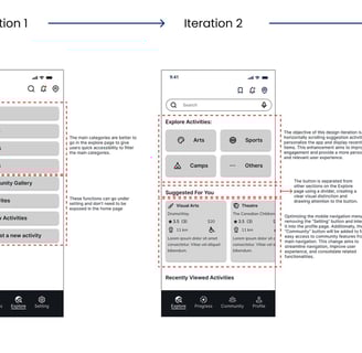
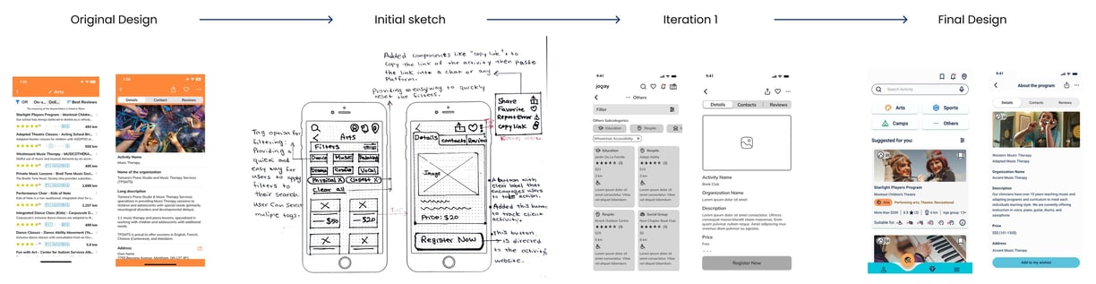
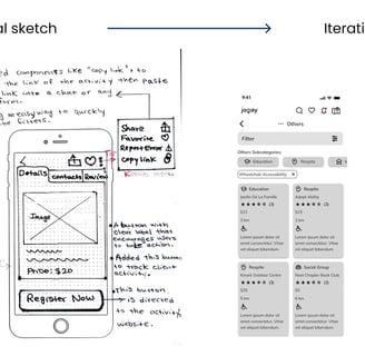
Iterative Design Process
Using the heuristic evaluation outcome and incorporating insights from user research, we created low- and mid-fidelity wireframes. We then refined our designs through iterative sketches informed by usability test results and stakeholder feedback. Finally, we developed high-fidelity prototypes.
Below are two examples showcasing the iteration process.